

Skintegrity is a skincare business dedicated to providing personalized skin treatments and expert care.
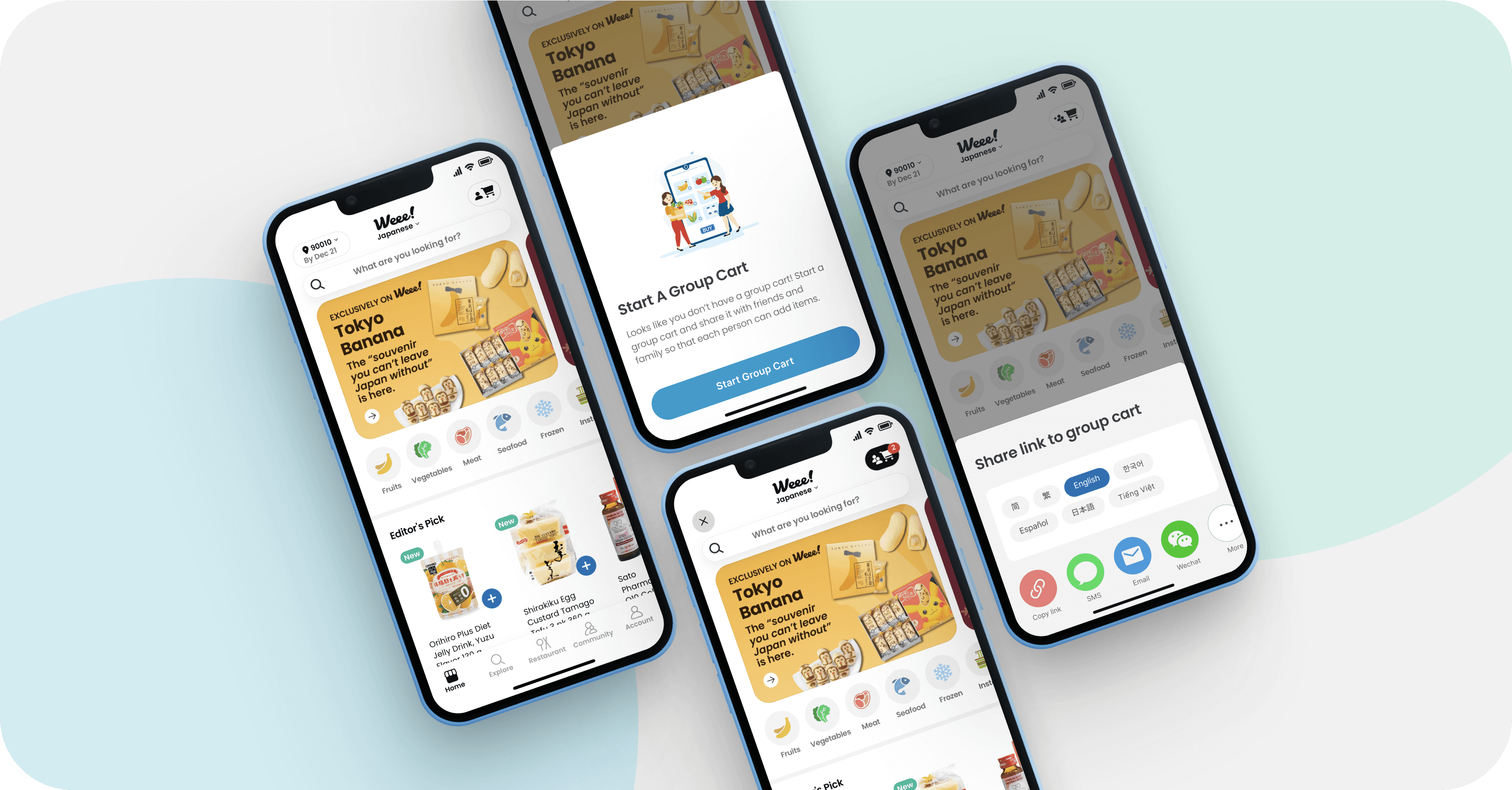
Known for their high quality products and services, Skintegrity focuses on helping clients achieve healthy, radiant skin through a combination of professional treatments and tailored skincare recommendations. Despite having a website and active Instagram presence, there was no centralized platform for seamless interaction. To solve this, we designed the Skintegrity Web App, an all-in-one portal designed to enhance the client experience.


DESIGNING FOR SEAMLESS SKINCARE: MY PROCESS
My design process began with a deep dive into user needs and industry standards.
I started my process with an in-depth exploration of industry standards, user needs, and business objectives to build a solid foundation for the design. By thoroughly understanding these aspects, I aimed to uncover pain points and identify opportunities for improvement. Additionally, I analyzed existing solutions in the market to draw inspiration, identify gaps, and ensure that the final product would offer an innovative and user-centric experience.
RESEARCH
Exploring User Needs and Gaps in the Skincare Market
Our first step was extensive research to better understand both client behaviors and the competitive landscape. We conducted surveys, user interviews, and competitive analysis. We surveyed 33 adults aged 25-35 who maintained a minimum two-step daily skincare routine. This requirement ensured that participants had an established skincare habit, making them more likely to provide relevant and insightful feedback for our research.
First, we surveyed 33 adults aged 25-35 who maintained a minimum two-step daily skincare routine. This requirement ensured participants had established skincare habits, likely leading to more relevant, insightful feedback.
THE SURVEY RESULTS ARE IN
96%
were interested in seeking professional skin treatments.
78%
would consider changing their skincare routine based on professional recommendations.
59%
expressed a desire for a consistent go-to skincare professional.
We then interviewed Skintegrity clients to understand their communication habits and frustrations, revealing a clear need for a cohesive platform.
CLIENT VOICES

Finally, we looked at both direct competitors in skincare apps and indirect ones in telehealth.
COMPETITIVE ANALYSIS

Through surveys, interviews, and competitive analysis, we uncovered critical insights into client expectations and industry gaps.
Centralized Communication: Clients want a single platform to book, chat, and get recommendations.
Need for Personalization: Users value tailored guidance and would adjust routines based on expert advice.
Competitive Gap: Existing apps lack an integrated solution for booking, shopping, and communication.
Opportunity: Design a unified app to strengthen client trust and position Skintegrity as a go-to skincare resource.
How might we centralize client communication to enhance consistency and build trust in our brand’s services and products?
MAPPING THE APP
Organizing the Structure by Core Services
I mapped out the application structure based on Skintegrity’s primary services: booking treatments, managing skincare routines, shopping for products, and messaging estheticians. This approach ensured that the app’s navigation mirrored the natural flow of user needs while prioritizing the most-used features.

MAPPING THE JOURNEY
Essential User Flows & Task Paths
I identified the two most common task flows for Skintegrity app users: booking a service and purchasing products. These flows were prioritized to ensure a seamless, user-friendly experience that addresses the primary needs of our clients.
USER FLOW 1
Reserve a skincare appointment

USER FLOW 2
Shop products

DESIGN PRINCIPLES
I wanted to make sure that users could easily access the most important features—such as booking, shopping, and messaging—without unnecessary distractions.
This keeps the experience efficient and focused on their needs. We applied the following design principles throughout the app’s development.
Prioritize essential functions
By focusing on key features like booking, shopping, and messaging, we minimized distractions and ensured users can find what they need quickly.
Provide clear signposts
Simple navigation and clear CTAs guide users through the experience effortlessly.
Less is more
We embraced minimalism in the design to reduce cognitive load, keeping the interface clean and user-friendly.
Give users full control
Clients have full control over their bookings, routines, and purchases, making the experience feel personalized and empowering.
KEY FLOWS
After defining the task flows, I created wireframes to visually structure the redesigned user experience.
This step was crucial for translating the newly optimized flows into a functional layout, ensuring each interaction was intuitive and seamless. Wireframing helped clarify design decisions and provided a solid foundation for development.
WIREFRAME 1
Reserve a skincare appointment

WIREFRAME 2
Shop products

CRAFTING THE UI KIT
Creating the Foundation for Visual Consistency
After wireframing, I created a UI kit that aligns with Skintegrity's branding. The color palette draws from their existing light blue and lavender hues, evoking a sense of calm and trust. To add vibrancy and contrast, I introduced a pastel orange inspired by the logo, ensuring key elements stand out while maintaining visual harmony. This cohesive design foundation set the stage for a user-friendly and aesthetically pleasing app experience.
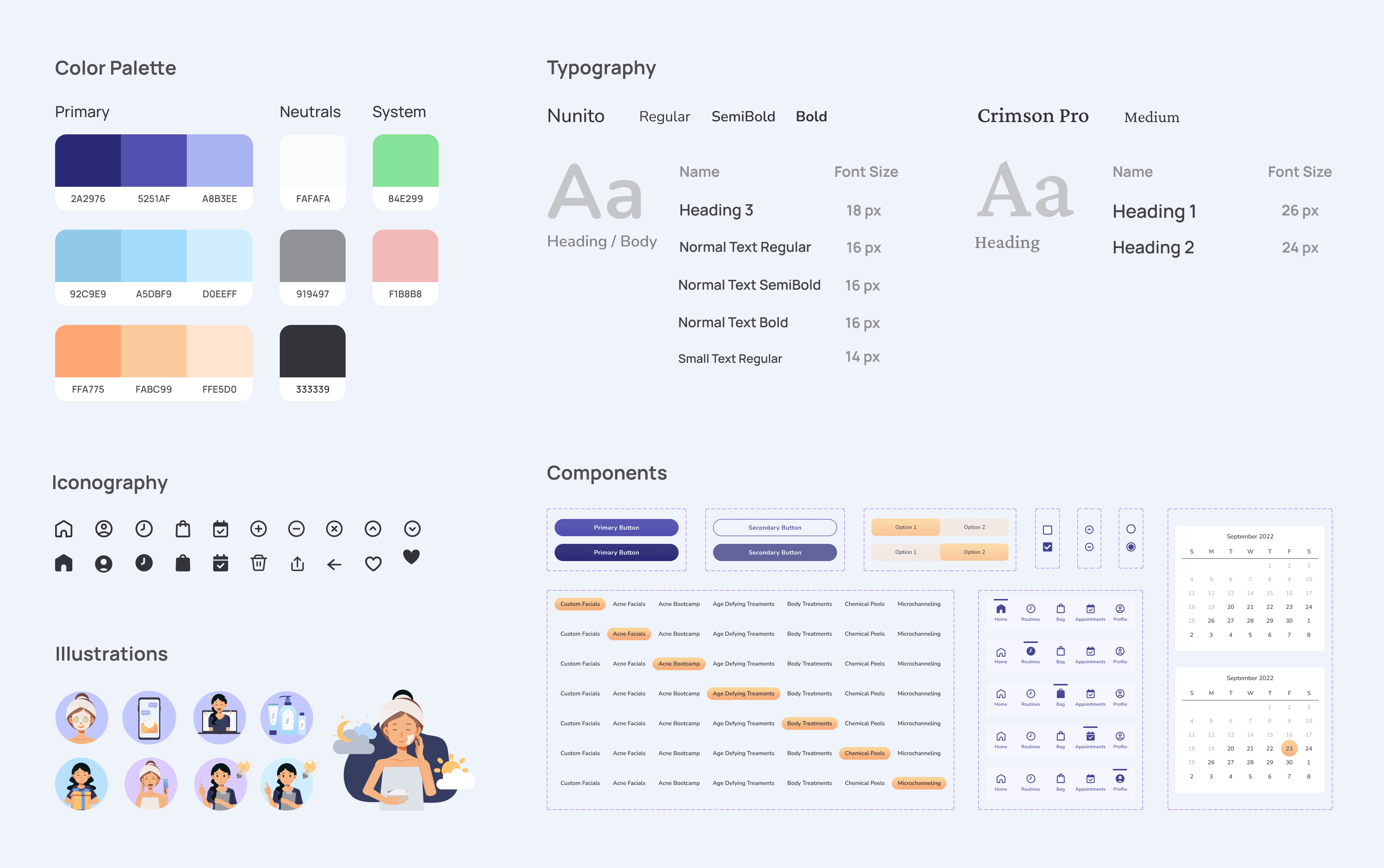
After finalizing the UI kit, I applied it to the first interactive prototype to ensure a cohesive visual identity and test how the design principles translated into a functional, user-friendly experience.
ONTO USABILITY TESTING
To evaluate the prototype's functionality and user experience, I conducted usability testing with five Skintegrity clients via Google Hangouts.
These clients varied in their interaction frequency—some scheduled services twice a month, others once a month, but all shopped for products regularly and frequently messaged their esthetician. The testing sessions were guided by ten carefully defined actions:
Locate where to book a service
Add additional services to your treatment
Select your esthetician for this service
Reserve this service appointment without paying
View your upcoming appointment
Locate where to shop for products
Add products to bag
Continue bag checkout
Locate your morning and evening skincare routine
Locate where to message your esthetician
USABILITY TESTING INSIGHTS
Testing Highlighted Areas of Confusion and Improvement
Nearly all users successfully completed the assigned tasks, though a few areas revealed minor challenges where users encountered some difficulty.

FROM FEEDBACK TO REFINEMENT
Testing Highlighted Areas of Confusion and Improvement
Usability testing provided invaluable insights into how users interacted with key prototype screens, revealing opportunities for improvement. Three screens stood out for iteration:
Add to Service: Users tapped on the text rather than the checkbox when adding to their existing service, indicating they expected the entire area to be interactive.
Unclear Copy: Users were uncertain if certain services were applicable to them because of unclear language.
Increase Tap Target Size
PROBLEM
Rather than tapping the checkbox directly, testers tapped on the text to select a treatment add-on.
SOLUTION
Enhanced tap target size to make the text itself fully interactive.


Unclear Copy
PROBLEM
Users found the copy was unclear.
SOLUTION
Updated the copy to provide clearer instructions about the service's availability.


KEY TAKEAWAYS
Personalization Builds Trust
The Skintegrity Web App addresses a critical pain point by centralizing communication and streamlining user interactions. Clients now have everything they need in one place—booking treatments, managing routines, shopping for products, and communicating directly with their esthetician. The personalized experience fosters trust, encourages ongoing engagement with the brand, and has generated excitement from clients eager to use the app. Positive feedback from the founder further reinforces the app's potential to elevate the Skintegrity experience.
CHECK OUT MY OTHER PROJECTS

Skintegrity
Skintegrity
Skincare Connected: The All-in-One Skincare App
Skincare Connected: The All-in-One Skincare App
Skincare Connected: The All-in-One Skincare App
PROJECT SCOPE
Mobile iOS App
ROLE
UX Designer
UX Researcher
TOOLS
Figma
Miro
Google Suite
DURATION
11 weeks
TOOLS
Figma
Miro
Google Suite
DURATION
11 weeks
Skintegrity is a skincare business dedicated to providing personalized skin treatments and expert care.
Known for their high quality products and services, Skintegrity focuses on helping clients achieve healthy, radiant skin through a combination of professional treatments and tailored skincare recommendations. Despite having a website and active Instagram presence, there was no centralized platform for seamless interaction. To solve this, we designed the Skintegrity Web App, an all-in-one portal designed to enhance the client experience.
DESIGNING FOR SEAMLESS SKINCARE: MY PROCESS
My design process began with a deep dive into user needs and industry standards.
I started my process with an in-depth exploration of industry standards, user needs, and business objectives to build a solid foundation for the design. By thoroughly understanding these aspects, I aimed to uncover pain points and identify opportunities for improvement. Additionally, I analyzed existing solutions in the market to draw inspiration, identify gaps, and ensure that the final product would offer an innovative and user-centric experience.
RESEARCH
Exploring User Needs and Gaps in the Skincare Market
Our first step was extensive research to better understand both client behaviors and the competitive landscape. We conducted surveys, user interviews, and competitive analysis. We surveyed 33 adults aged 25-35 who maintained a minimum two-step daily skincare routine. This requirement ensured that participants had an established skincare habit, making them more likely to provide relevant and insightful feedback for our research.
First, we surveyed 33 adults aged 25-35 who maintained a minimum two-step daily skincare routine. This requirement ensured participants had established skincare habits, likely leading to more relevant, insightful feedback.
THE SURVEY RESULTS ARE IN
96%
96%
were interested in seeking professional skin treatments.
were interested in seeking professional skin treatments.
78%
78%
would consider changing their skincare routine based on professional recommendations.
would consider changing their skincare routine based on professional recommendations.
59%
59%
expressed a desire for a consistent go-to skincare professional.
expressed a desire for a consistent go-to skincare professional.
We then interviewed Skintegrity clients to understand their communication habits and frustrations, revealing a clear need for a cohesive platform.
CLIENT VOICES
Finally, we looked at both direct competitors in skincare apps and indirect ones in telehealth.
COMPETITIVE ANALYSIS
Through surveys, interviews, and competitive analysis, we uncovered critical insights into client expectations and industry gaps.
Centralized Communication: Clients want a single platform to book, chat, and get recommendations.
Need for Personalization: Users value tailored guidance and would adjust routines based on expert advice.
Competitive Gap: Existing apps lack an integrated solution for booking, shopping, and communication.
Opportunity: Design a unified app to strengthen client trust and position Skintegrity as a go-to skincare resource.
How might we centralize client communication to enhance consistency and build trust in our brand’s services and products?
MAPPING THE APP
Organizing the Structure by Core Services
I mapped out the application structure based on Skintegrity’s primary services: booking treatments, managing skincare routines, shopping for products, and messaging estheticians. This approach ensured that the app’s navigation mirrored the natural flow of user needs while prioritizing the most-used features.
MAPPING THE JOURNEY
Essential User Flows & Task Paths
I identified the two most common task flows for Skintegrity app users: booking a service and purchasing products. These flows were prioritized to ensure a seamless, user-friendly experience that addresses the primary needs of our clients.
USER FLOW 1
Reserve a skincare appointment
USER FLOW 2
Shop products
DESIGN PRINCIPLES
I wanted to make sure that users could easily access the most important features—such as booking, shopping, and messaging—without unnecessary distractions.
This keeps the experience efficient and focused on their needs. We applied the following design principles throughout the app’s development.
Prioritize essential functions
By focusing on key features like booking, shopping, and messaging, we minimized distractions and ensured users can find what they need quickly.
Provide clear signposts
Simple navigation and clear CTAs guide users through the experience effortlessly.
Less is more
We embraced minimalism in the design to reduce cognitive load, keeping the interface clean and user-friendly.
Give users full control
Clients have full control over their bookings, routines, and purchases, making the experience feel personalized and empowering.
KEY FLOWS
After defining the task flows, I created wireframes to visually structure the redesigned user experience.
This step was crucial for translating the newly optimized flows into a functional layout, ensuring each interaction was intuitive and seamless. Wireframing helped clarify design decisions and provided a solid foundation for development.
WIREFRAME 1
Reserve a skincare appointment
WIREFRAME 2
Shop products
CRAFTING THE UI KIT
Creating the Foundation for Visual Consistency
After wireframing, I created a UI kit that aligns with Skintegrity's branding. The color palette draws from their existing light blue and lavender hues, evoking a sense of calm and trust. To add vibrancy and contrast, I introduced a pastel orange inspired by the logo, ensuring key elements stand out while maintaining visual harmony. This cohesive design foundation set the stage for a user-friendly and aesthetically pleasing app experience.
After finalizing the UI kit, I applied it to the first interactive prototype to ensure a cohesive visual identity and test how the design principles translated into a functional, user-friendly experience.
ONTO USABILITY TESTING
To evaluate the prototype's functionality and user experience, I conducted usability testing with five Skintegrity clients via Google Hangouts.
These clients varied in their interaction frequency—some scheduled services twice a month, others once a month, but all shopped for products regularly and frequently messaged their esthetician. The testing sessions were guided by ten carefully defined actions:
Locate where to book a service
Add additional services to your treatment
Select your esthetician for this service
Reserve this service appointment without paying
View your upcoming appointment
Locate where to shop for products
Add products to bag
Continue bag checkout
Locate your morning and evening skincare routine
Locate where to message your esthetician
USABILITY TESTING INSIGHTS
Testing Highlighted Areas of Confusion and Improvement
Nearly all users successfully completed the assigned tasks, though a few areas revealed minor challenges where users encountered some difficulty.
FROM FEEDBACK TO REFINEMENT
Testing Highlighted Areas of Confusion and Improvement
Usability testing provided invaluable insights into how users interacted with key prototype screens, revealing opportunities for improvement. Three screens stood out for iteration:
Add to Service: Users tapped on the text rather than the checkbox when adding to their existing service, indicating they expected the entire area to be interactive.
Unclear Copy: Users were uncertain if certain services were applicable to them because of unclear language.
Increase Tap Target Size
PROBLEM
Rather than tapping the checkbox directly, testers tapped on the text to select a treatment add-on.
SOLUTION
Enhanced tap target size to make the text itself fully interactive.
Unclear Copy
PROBLEM
Users found the copy was unclear.
SOLUTION
Updated the copy to provide clearer instructions about the service's availability.
KEY TAKEAWAYS
Personalization Builds Trust
The Skintegrity Web App addresses a critical pain point by centralizing communication and streamlining user interactions. Clients now have everything they need in one place—booking treatments, managing routines, shopping for products, and communicating directly with their esthetician. The personalized experience fosters trust, encourages ongoing engagement with the brand, and has generated excitement from clients eager to use the app. Positive feedback from the founder further reinforces the app's potential to elevate the Skintegrity experience.
CHECK OUT MY OTHER PROJECTS