International American University
Digitizing the Admissions Application Form
PROJECT SCOPE
Digital College Admissions Form
ROLE
UX Designer
UX Researcher
TOOLS
Figma
FigJam
Google Suite
DURATION
30 weeks
At International American University (IAU), the admissions process is hindered by a one-size-fits-all application form and outdated submission method.
The university offers just two forms—one for all international applicants and another for domestic or online-only students—leading to confusion due to differing requirements. This lack of differentiation causes challenges for both students and admissions staff. To address this, I digitized the application form, streamlining submissions, reducing applicant confusion, and minimizing follow-up from admissions advisors.
THE PATH TO U.S. EDUCATION
Students from around the world are attracted to the U.S. for its diverse academic programs and cultural exchange.
College admissions can be a long and confusing process, especially for international students (can you imagine navigating it in a language that isn’t native to you?). To keep things clear, this case study focuses on the admissions application form itself. If you’re curious about the full admissions journey—from the first touchpoint to the last—you're in luck! That case study is in the works and will be available soon. 🙂
Let's take a look at the Admissions Application form.


Applicants struggled with parts of the admissions website and application, often contacting the Office of Admissions with questions that should have been easily addressed online.
This inefficient user journey diverted the admissions team's time and attention away from more critical tasks. To better understand the challenges faced by international applicants, I created a user persona: Hoa Truong, an F-1 student from Vietnam aspiring to enroll in an MBA program.

I mapped each applicant type's unique application flow to present only the relevant documents and information fields.
The flow map below shows each applicant type's required documents and details during their application process, eliminating unnecessary fields and confusion. This approach tailors the process to each applicant type, enhancing clarity, minimizing errors or delays, and ensuring applicants submit only the required documents and details upfront.

Based on what we know about Hoa, she would follow the route for F-1 Transfer Applicants. However, key information about required documents and steps are buried in dense text, making it difficult for applicants like Hoa to navigate and understand what is needed. This creates frustration and increases the likelihood of errors or incomplete submissions.
Introducing the digitized Admissions Application Form.
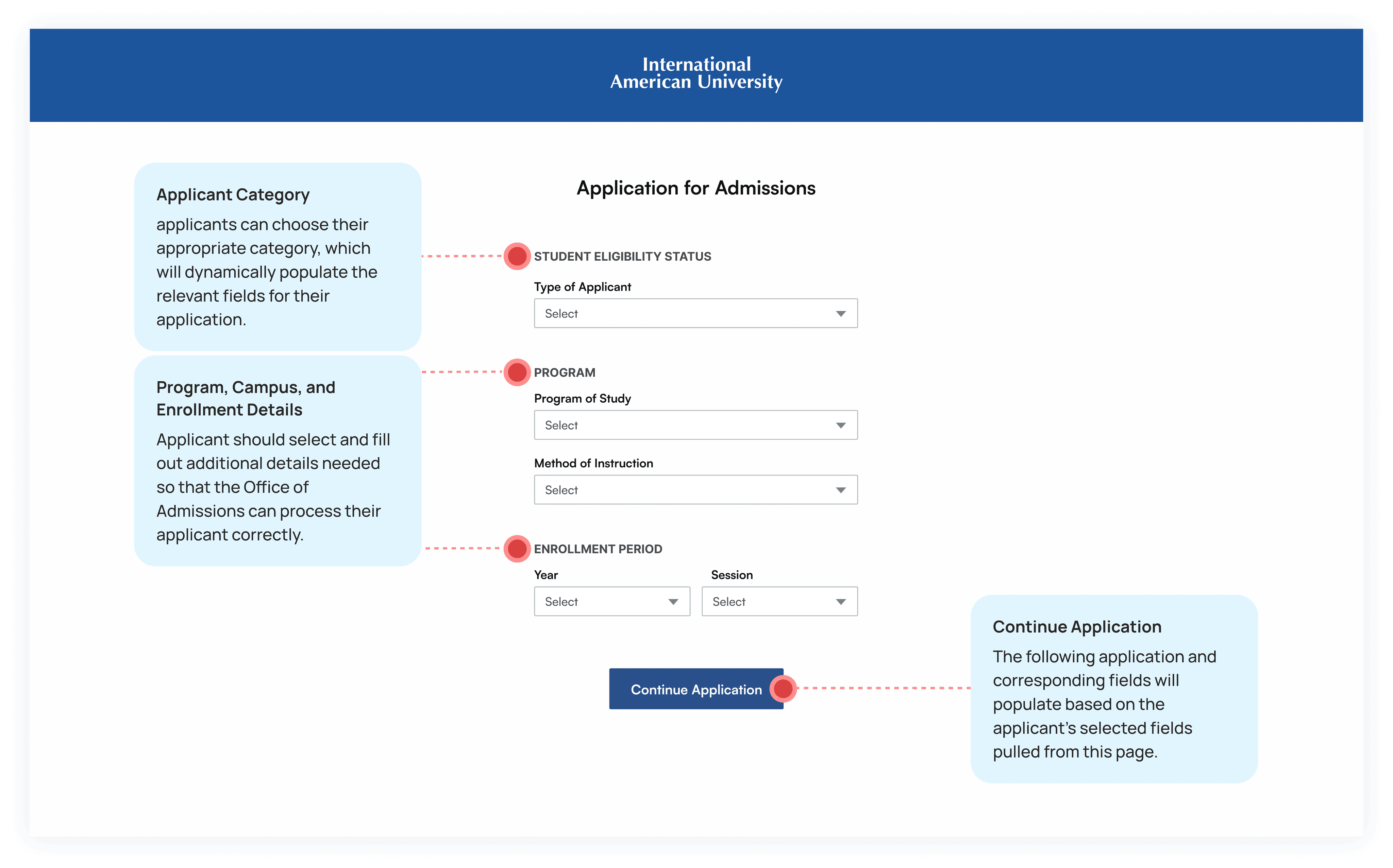
Instead of downloading a PDF form, when applicants click "Apply" on the website, they would be directed to the application page.
This new approach allows applicants to select their specific status and program, which then populates the relevant fields in the subsequent pages of the application. By tailoring the form to each applicant’s information, we reduce confusion, improve the user experience, and ensure applicants only see fields applicable to them.
PART 1 OF 8
Applicant Information

Full Name
Contact Details
U.S Mailing Address
Identification Details
Demographic
Tool Tips as needed
PART 2 OF 8
Dependent Information
Dependent Details
Upload Dependent Documents
CTA for additional dependents
Tool Tips as needed

PART 3 OF 8
Emergency Contact
Dependent Details
Upload Dependent Documents
CTA for additional dependents

PART 4 OF 8
Documents
Upload Academic Credentials
Enter Passport Details
Upload Travel and Immigration Documents
Upload Financial Documents
Upload English Profficiency Document
Tool Tips as needed

PART 5 OF 8
Transfer Credit
Select yes or no to receive transfer credit
Upload Academic Credential(s) as needed to evaluate transfer credit
CTA to add additional academic credentials
Tool Tips as needed

PART 6 OF 8
Acknowledgements
Mark each applicable statement
Exact School Performance Fact Sheet linked as needed for applicant to download, sign and upload
Tool Tips as needed

PART 7 OF 8
Review Information
Edit fields as needed
Sign and continue
PART 8 OF 8
Payment
Select payment method
Enter payment details
Enter agent or other code
Show all applicable fees

SUBMISSION
Confirmation
Include contact details for the Office of Admissions
Specify application review processing timeframe

STAKEHOLDER FEEDBACK
Testing the design wasn’t possible at the time, but I gathered valuable feedback from key stakeholders, including admissions advisors who work closely with applicants on a daily basis.
Opt to exclude payment and review page from the application — both actions may not be feasible.
Titles per page should be revised somehow — Titles should provide more instructions for applicants viewing the form.
The sections of the form requiring applicants to upload multiple documents, remain somewhat confusing and lengthy.
International American University
Digitizing the Admissions Application Form
PROJECT SCOPE
Digital College Admissions Form
ROLE
UX Designer
UX Researcher
TOOLS
Figma
FigJam
Google Suite
DURATION
30 weeks
At International American University (IAU), the admissions process is hindered by a one-size-fits-all application form and outdated submission method.
The university offers just two forms—one for all international student visa applicants and another for standard (non-student visa) applicants —leading to confusion due to differing requirements. This lack of differentiation causes challenges for both students and admissions staff. To address this, I digitized the application form, streamlining submissions, reducing applicant confusion, and minimizing follow-up from admissions advisors.
THE PATH TO U.S.
EDUCATION
Students from around the world are attracted to the U.S. for its diverse academic programs and cultural exchange.
College admissions can be a long and confusing process, especially for international students (can you imagine navigating it in a language that isn’t native to you?). To keep things clear, this case study focuses on the admissions application form itself. If you’re curious about the full admissions journey—from the first touchpoint to the last—you're in luck! That case study is in the works and will be available soon. 🙂
Let's take a look at the current Admissions Application form.
Applicants struggled with parts of the admissions website and application, often contacting the Office of Admissions with questions that should have been easily addressed online.
D
This inefficient user journey diverted the admissions team's time and attention away from more critical tasks. To better understand the challenges faced by international applicants, I created a user persona: Hoa Truong, an F-1 student from Vietnam aspiring to enroll in an MBA program.
I mapped each applicant type's unique application flow to present only the relevant documents and information fields.
D
The flow map below shows each applicant type's required documents and details during their application process, eliminating unnecessary fields and confusion. This approach tailors the process to each applicant type, enhancing clarity, minimizing errors or delays, and ensuring applicants submit only the required documents and details upfront.
Based on what we know about Hoa, she would follow the route for F-1 Transfer Applicants. However, key information about required documents and steps are buried in dense text, making it difficult for applicants like Hoa to navigate and understand what is needed. This creates frustration and increases the likelihood of errors or incomplete submissions.
Introducing the digitized Admissions Application Form.
Instead of downloading a PDF form, when applicants click "Apply" on the website, they would be directed to the application page.
This new approach allows applicants to select their specific status and program, which then populates the relevant fields in the subsequent pages of the application. By tailoring the form to each applicant’s information, we reduce confusion, improve the user experience, and ensure applicants only see fields applicable to them.
The web application replaces the outdated PDF checklist by clearly guiding applicants on the required documents to submit.
I structured this application into eight pages, each tailored to specific categories and requirements based on the applicant's needs. These categories were organized using insights from card sorting findings and stakeholder interviews.
PART 1 OF 8
Applicant Information
Full Name
Contact Details
U.S Mailing Address
Identification Details
Demographic
Tool Tips as needed

PART 2 OF 8
Dependent Information
Dependent Details
Upload Dependent Documents
CTA for additional dependents
Tool Tips as needed

PART 3 OF 8
Emergency Contact
Emergency Contact Name
Contact Information

PART 4 OF 8
Documents
Upload Academic Credentials
Enter Passport Details
Upload Travel and Immigration Documents
Upload Financial Documents
Upload English Profficiency Document
Tool Tips as needed

PART 5 OF 8
Transfer Credit
Select yes or no to receive transfer credit
Upload Academic Credential(s) as needed to evaluate transfer credit
CTA to add additional academic credentials
Tool Tips as needed

PART 6 OF 8
Acknowledgements
Mark each applicable statement
Exact School Performance Fact Sheet linked as needed for applicant to download, sign and upload
Tool Tips as needed
PART 7 OF 8
Review Information
Edit fields as needed
Sign and continue
PART 8 OF 8
Payment
Select payment method
Enter payment details
Enter agent or other code
Show all applicable fees
SUBMISSION
Confirmation
Include contact details for the Office of Admissions
Specify application review processing timeframe
STAKEHOLDER FEEDBACK
Testing the design wasn’t possible at the time, but I gathered valuable feedback from key stakeholders, including admissions advisors who work closely with applicants on a daily basis.
Opt to exclude payment and review page from the application — both actions may not be feasible.
Titles per page should be revised somehow — Titles should provide more instructions for applicants viewing the form.
The sections of the form requiring applicants to upload multiple documents, remain somewhat confusing and lengthy.
I gave the navigation bar a clean, new look.


Let's take a look at version 2 of the digital application form.
Let's take a look at version 2 of the digital application form.
PART 1 OF 1
Profile
Included progress bar
Renamed page titles with questions/directions
Divided into four sections to reduce cognitive overload


PART 2 OF 8
Supporting Documents
Included progress bar
Rearranged supporting documents to immediately follow profile section
Divided this portion into six sections to reduce cognitive overload
Provided clear instructions and document requirements on each page
Increased area for user to drag and drop document for uploading


PART 3 OF 8
Education
Included progress bar
Created a new section for Education which included academic credential submission and transfer credit acknowledgement/submission


PART 4 OF 8
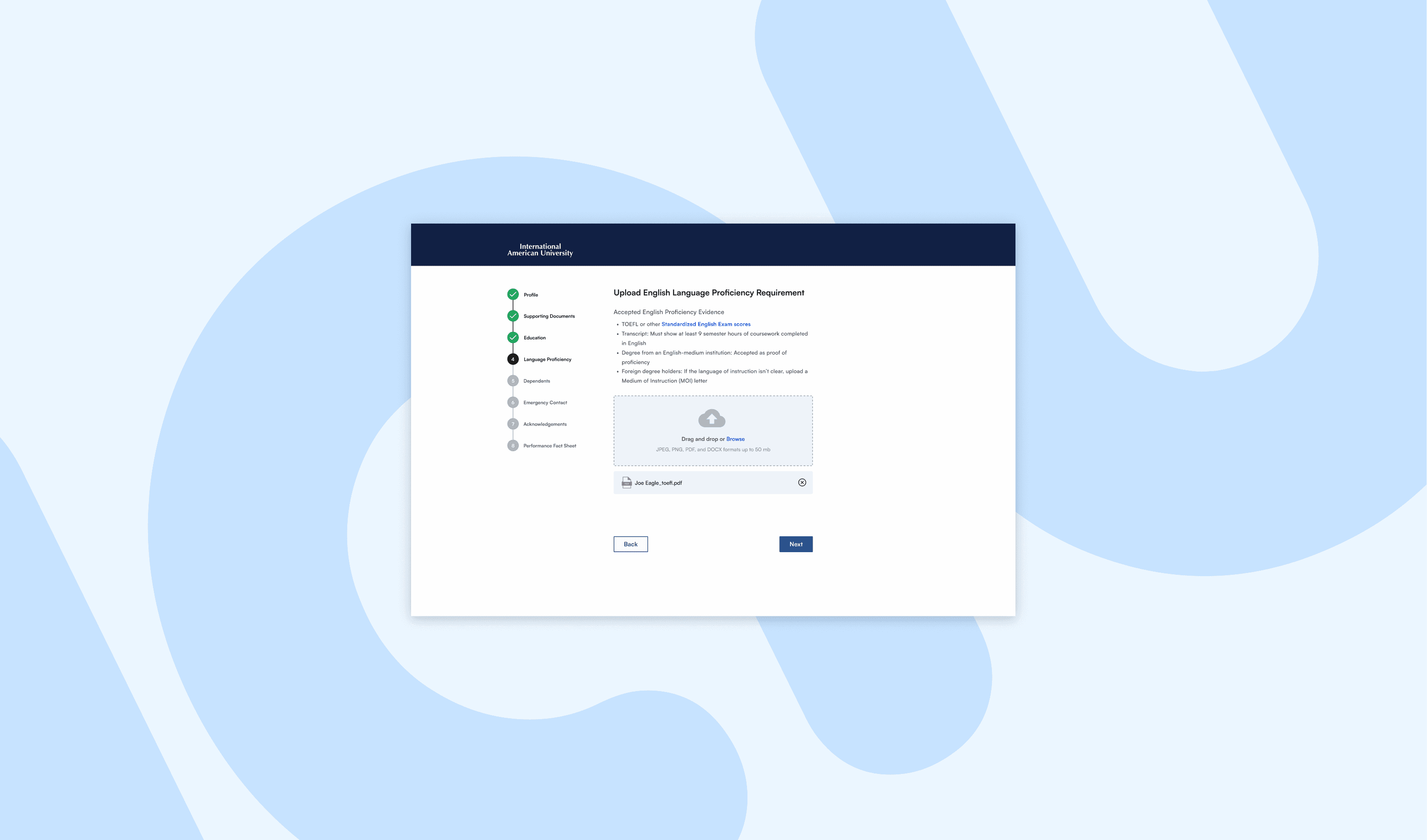
Language Proficiency
Created a new section for language proficiency

PART 5 OF 8
Dependents
Included progress bar
Dependent section is divided into 2 pages: 1) input dependent information and 2) upload dependent documents. Applicant may skip if section does not apply to them


PART 6 OF 8
Emergency Contact
Simplified emergency contact section so that only name, relationship and contact number are needed

PART 7 OF 8
Acknoledgements
Revised to have a standalone acknowledgements section

PART 8 OF 8
Performance Fact Sheet
Revised to have a standalone Performance Fact Sheet section

RESULTS
This project began as a personal initiative, where I identified inefficiencies in the admissions process and created the admissions application form for a digital application system.
After presenting my concept to the CEO, he entrusted me with the responsibility of working alongside the engineering team to implement the designs.
Initially, the plan was to host the new application system on AWS, but midway through implementation of the latest designs, the project budget was pulled. Due to the budget being reallocated, we were no longer able to work with the engineering team, causing us to pivot our approach. Now, the design team is collaborating with our internal tech team to revamp the admissions journey on the university’s website. Additionally, we are applying the principles from this project to the admissions form within our existing Student Information Sustem (SIS) software, AmpEducator.
This experience underscored the importance of adaptability in design projects, especially when resources are limited. It also demonstrated how proactive problem-solving and stakeholder alignment can turn a self-initiated project into a broader, cross-departmental effort.
NEXT STEPS
The next phase will center on improving the admissions process through the following actions:
Finalize Website Admissions Flow
Continue to refine the revamped admissions journey on the university’s website, focusing on creating an intuitive and user-friendly experience for applicants.
Create Instructional Videos
Create instructional videos that explain how to complete the application process, upload required documents, and understand key sections of the form.
Collaborate with Internal Teams
Work alongside tech team to implement these updates effectively. Ensure alignment with university goals and applicant needs through regular stakeholder meetings.
Evaluate and Iterate
Once the new updates are live, we will gather feedback from applicants and staff to identify and address improvement areas through iterative updates.
PART 1 OF 1
Profile
Included progress bar
Renamed page titles with questions/directions
Divided into four sections to reduce cognitive overload
PART 2 OF 8
Supporting Documents
Included progress bar
Rearranged supporting documents to immediately follow profile section
Divided this portion into six sections to reduce cognitive overload
Provided clear instructions and document requirements on each page
Increased area for user to drag and drop document for uploading
PART 3 OF 8
Education
Included progress bar
Created a new section for Education which included academic credential submission and transfer credit acknowledgement/submission
PART 4 OF 8
Language Proficiency
Created a new section for language proficiency
PART 5 OF 8
Dependents
Included progress bar
Dependent section is divided into 2 pages: 1) input dependent information and 2) upload dependent documents. Applicant may skip if section does not apply to them
PART 6 OF 8
Emergency Contact
Simplified emergency contact section so that only name, relationship and contact number are needed
PART 7 OF 8
Acknoledgements
Revised to have a standalone acknowledgements section
PART 8 OF 8
Performance Fact Sheet
Revised to have a standalone Performance Fact Sheet section
RESULTS
This project began as a personal initiative, where I identified inefficiencies in the admissions process and created the admissions application form for a digital application system.
After presenting my concept to the CEO, he entrusted me with the responsibility of working alongside the engineering team to implement the designs.
Initially, the plan was to host the new application system on AWS, but midway through implementation of the latest designs, the project budget was pulled. Due to the budget being reallocated, we were no longer able to work with the engineering team, causing us to pivot our approach. Now, the design team is collaborating with our internal tech team to revamp the admissions journey on the university’s website. Additionally, we are applying the principles from this project to the admissions form within our existing Student Information Sustem (SIS) software, AmpEducator.
This experience underscored the importance of adaptability in design projects, especially when resources are limited. It also demonstrated how proactive problem-solving and stakeholder alignment can turn a self-initiated project into a broader, cross-departmental effort.
NEXT STEPS
The next phase will center on improving the admissions process through the following actions:
Finalize Website Admissions Flow
Continue to refine the revamped admissions journey on the university’s website, focusing on creating an intuitive and user-friendly experience for applicants.
Create Instructional Videos
Create instructional videos that explain how to complete the application process, upload required documents, and understand key sections of the form.
Collaborate with Internal Teams
Work alongside tech team to implement these updates effectively. Ensure alignment with university goals and applicant needs through regular stakeholder meetings.
Evaluate and Iterate
Once the new updates are live, we will gather feedback from applicants and staff to identify and address improvement areas through iterative updates.
CHECK OUT MY OTHER PROJECTS